Falkensteiner Family Resort Lido: the rooftop playground
A historic family hotel in the Pustertal valley has been extended and redesigned by studio NOA. The new wave deck embeds it into the landscape and makes it a place for sports and entertainment where you can ski, skate or walk in the middle of the Alpine nature.
A highly successful hotel has to be renovated without losing its identity, but rather strengthening it in terms of aesthetics, sustainability and services. This is the issue addressed by studio NOA in the redesign of the Falkensteiner Family Resort Lido in Casteldarne, in the Pustertal valley.
It is a historic hotel, the first to be opened by the Falkensteiner family, which today runs a group of more than 30 hospitality properties across 6 countries. Established in 1957 on the edge of the village on the shores of a small lake, the family resort has gradually expanded to cater for a clearly defined target group, that of families with children. The aim of the project was to add new spaces and functionalities that would reinforce this vocation, creating a kind of playground for the little guests and, at the same time, a place where parents could relax. A defining point of the project was also the beautiful Alpine surroundings, in which the hotel complex was meant to blend in harmoniously.
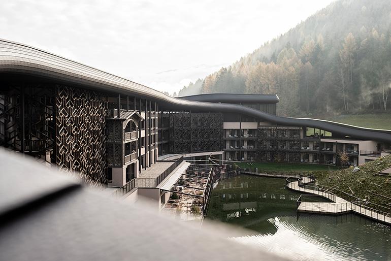
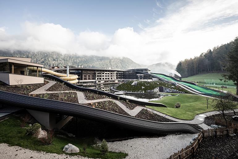
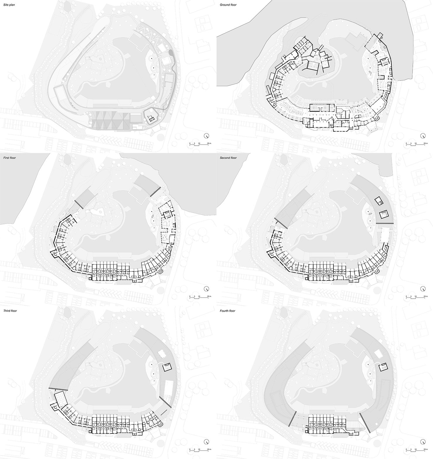
The solution proposed by NOA, commissioned to design the new structure, surprisingly started with the roof: the traditional gable roof of the old hotel complex was replaced by a large wave structure that covers new and existing buildings, sloping down on both sides until it disappears into the ground. It is a kind of hill that blends in with the landscape by covering itself with vegetation, and that transforms into a ski slope, skating rink, playground, adventure park, leisure and recreation area.
“We wanted to bring together the old and the new into a uniform whole,” explains architect Andreas Profanter. “The new roof allowed us to connect the various buildings in the complex and link them with the surrounding nature. But it also allowed us to invent new spaces, such as the ski slope, which enrich what we can offer to families.”
PLAYING ON THE ROOF
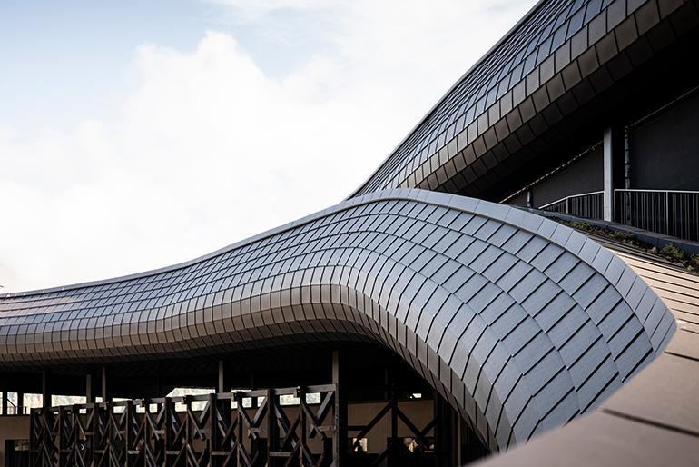
The roof designed by NOA spans 300 metres in length over an area of 4,900 square metres and reaches a height of 18 metres at its centre. It is a highly innovative element in terms of shape, size and materials used. The structure was made of reinforced concrete in the newly built part, while a system of steel beams and wood was used in the parts where it rests on the existing building. It is clad with metal shingles that, like a second skin, perfectly follow the curves and undulations of the roof.
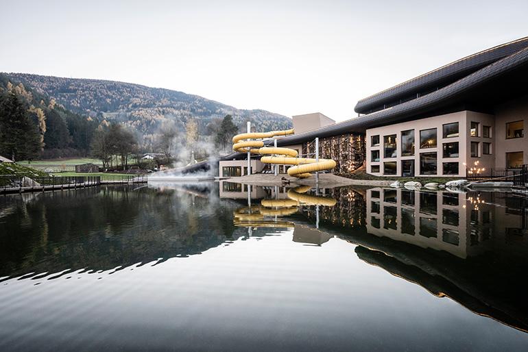
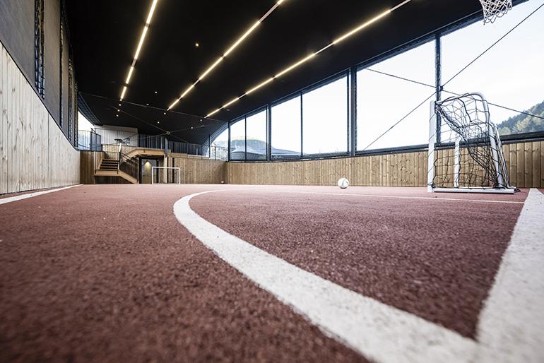
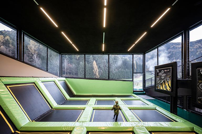
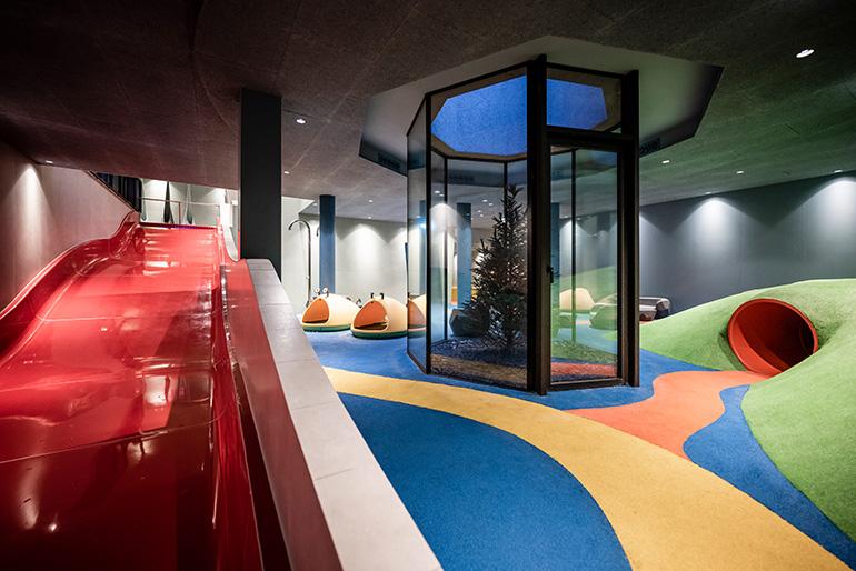
On this spacious roof, traversed by a loop trail where guests can enjoy a pleasant walk, is a recreational park offering various stations for sports and entertainment. One of the two slopes, the one to the east, is partly occupied by the 163-metre-long ski slope with a carpet lift. Whilst open to all resort guests, it is particularly suitable for children, who can learn to ski with the help of an instructor without leaving the hotel. Moreover, the artificial bottom allows year-round use, as is also the case with the skating rink, which is located at the highest point of the deck. On the other side, facing west, there is a large fitness area for the whole family, a bobby car track and an elevated mini adventure park, under which there is a field for football, basketball and other activities. Here, a 120-metre-long water slide winds its way over the lake to an area underground which is occupied by other play zones and the swimming pool. The slide stands out against the landscape with its bright yellow spirals and becomes the symbol of a place that is dedicated to the recreation and adventure of its young guests in every way.
Throughout the entire complex, recreational spaces are interspersed with green areas that create continuity with the forests in the valley.
“We literally brought nature up to the roof,” Andreas Profanter remarks. “The aim was to strengthen the link between the building and the landscape, without taking up any more land, but rather by creating added value and a new way of thinking about sustainability”.
A NEW AESTHETIC
“Our idea was also to revamp the look of the original building,” adds architect Wolfgang Heinz. “We, therefore, did not just enclose the new and existing parts of the resort under one roof, but we also worked on the facades to make the different architectural elements consistent with one another.”
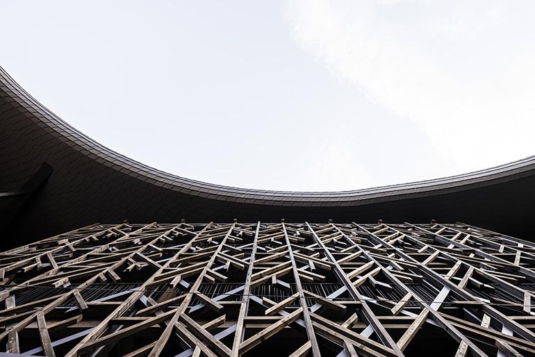
In addition to the choice of a single colour for all the wall structures, the use of geometric patterns in natural wood that give rhythm to the building, evoking the aesthetic of old alpine barns, should also be highlighted.
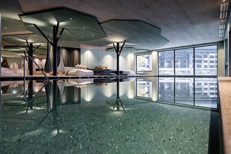
The relationship between the resort and the small lake it overlooks has also been ‘redesigned’, with the creation of an artificial hill along one bank, under which the adults’ spa is located. A large new terrace opens out onto the lakefront and the partially covered swimming pool which overflows onto the water mirror, giving guests the sensation of being authentically immersed in nature.
NATURE AND PLAY FOR THE INTERIOR
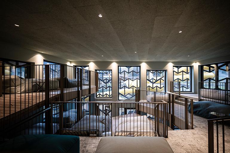
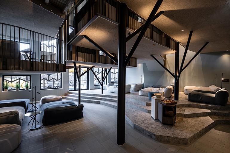
The NOA team has designed the resort’s interior, both new and existing parts, which have been newly styled and, in some cases, expanded.
“As with the exteriors, the interior design was steered on the one hand by the aim of creating a playful, child-friendly atmosphere, and on the other hand by a reference to the natural environment surrounding the resort,” clarifies interior designer Barbara Runggatscher.
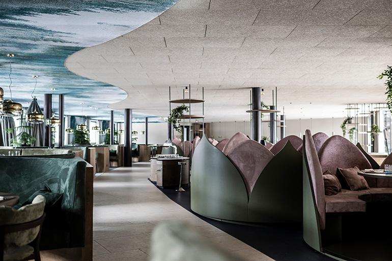
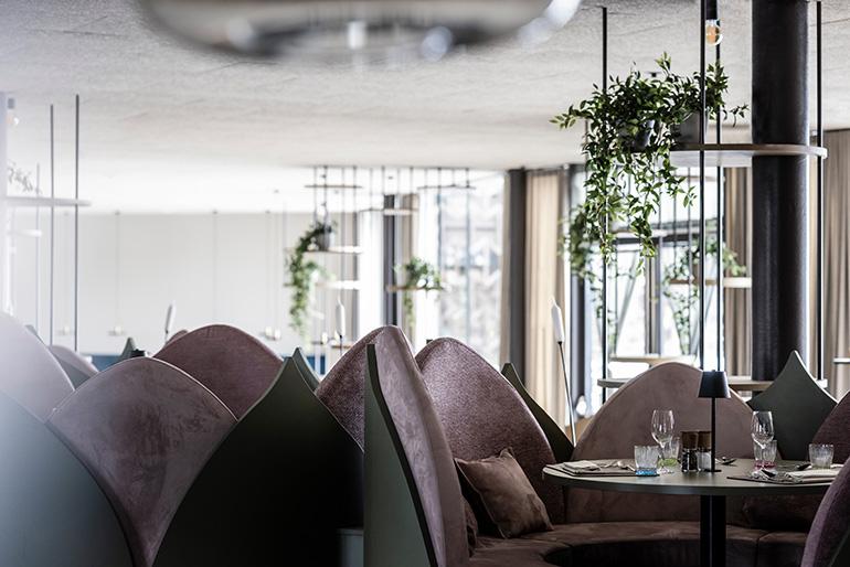
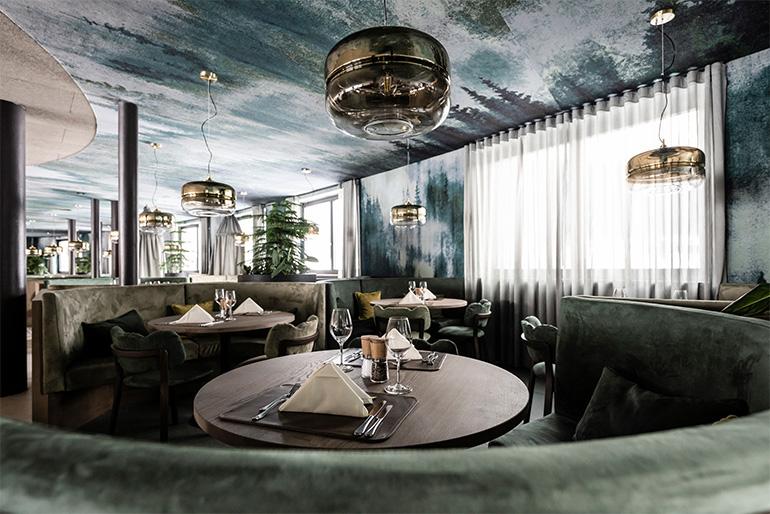
The restaurant, which has been extended to include a terrace and a play area for children, has been distributed across three levels to allow all diners to enjoy the view of the lake.
“The décor changes on each level: from the forest-inspired motifs of the innermost area to the lily pad-shaped seating in the middle area, and the reeds recalled by the particular shape of the lamps that illuminate the tables near the terrace,” explains the designer.
In the newly created buffet area, on the other hand, a lively market atmosphere has been recreated with a variety of different shaped stations in the form of small houses or wooden trolleys on wheels. Different heights allow children to access them and wide visibility of the kitchen areas and thus of the food being prepared.
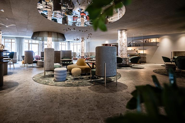
The entrance and reception area of the hotel retain their original layout but are given a new look. Here, the presence of numerous pillars inspired a new design language characterised by round shapes, bright colours and decorations referencing the flora and fauna of the forest. Finally, a cosy space with swings and merry-go-rounds for the little ones is flanked by a lounge for parents.
A NEST IN THE ROOM
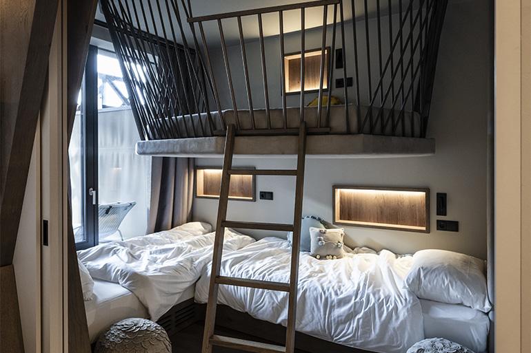
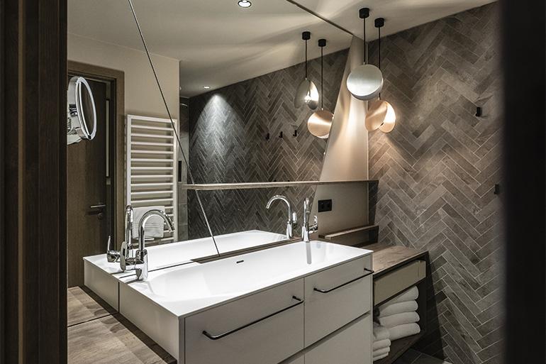
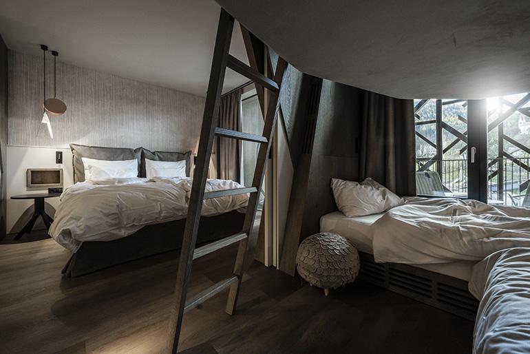
The NOA project also added 36 new rooms to the existing 82. It was an opportunity to define a new room type that, in its different variations, characterises the resort’s offer for families. The rooms include an area for parents and an area for children, which are separated by a sliding partition, and a large bathroom with washbasins at different heights.
“In the children’s area there are always three beds available, one of which, suspended from the ceiling, is a kind of nest-bed inspired by falcon which is the symbol of the hotel. Even when it is not occupied, it is always an opportunity for the little ones to play and have fun,” concludes interior architect Caterina Betti.

