New NOA headquarters
The challenges that NOA embraced when designing its new headquarters in Bolzano involved reimagining workspaces while embodying its own architectural vision. Through the targeted use of colour and an innovative spatial concept, the studio succeeded in giving the spaces maximum flexibility. These can change their appearance, functions, and atmosphere to adapt to different situations - a constant celebration of creativity.
For the architecture and interior design studio NOA, this marks the third relocation in Bolzano. Over 13 years of intense activity, the collective has grown, necessitating more space for team members, visiting clients, as well as the material library and model exhibition. It wasn't just about expanding, but creating an ecosystem that fosters creativity, stimulates innovation, and fully reflects NOA's essence. As the headquarters, Bolzano takes over the coordination between the additional branches in Milan, Turin and Berlin, also serving as a tangible expression of the studio's expressive capacity.
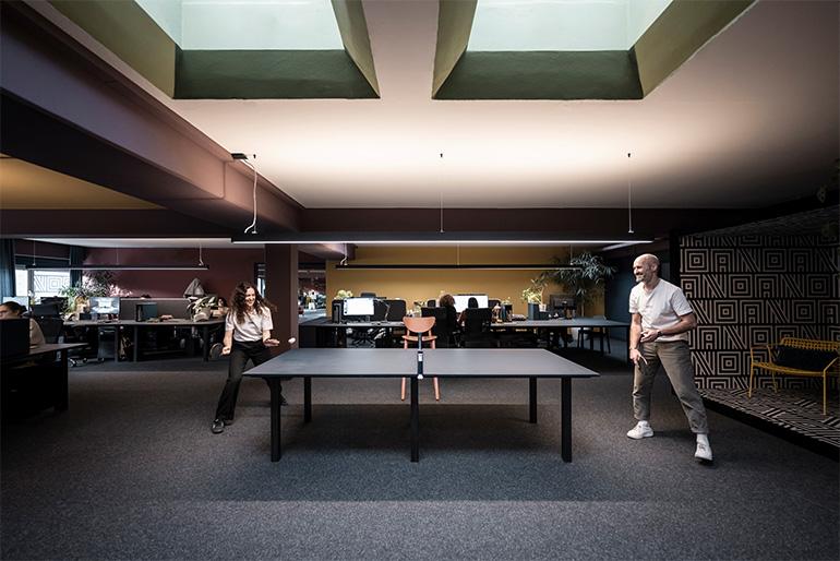
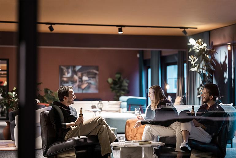
The drive to materialize NOA's identity was, therefore, the starting point for redesigning 1000 m2 on the top floor of a building in Bolzano's fair district—a strategic location, but one that had been transformed into a labyrinth of small rooms and corridors by previous uses. The interior design project — the facade was left untouched, except for a large window in the lobby — is based on the concept of community, collaborative working, and uniqueness. The aim was to create hybrid spaces where workspaces merge with different functions. It is a project where NOA seizes the opportunity to reflect on the role of the office in the 21st century. NOA still recognizes the importance of sharing physical spaces, as they impact the team's well-being and success.
“We believe that our sector greatly benefits from sharing physical workspace. The opportunity to exchange ideas quickly, the arising of unexpected synergies, and the building of close working groups all bring inestimable value to our projects that would be impossible without common workspaces. Inspired by the versatility of a chameleon, spaces here unfold in constant transformation. The furniture is constantly reconfigured”, explains Lukas Rungger, NOA co-founder.
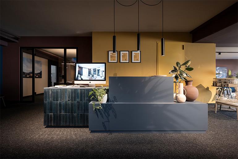
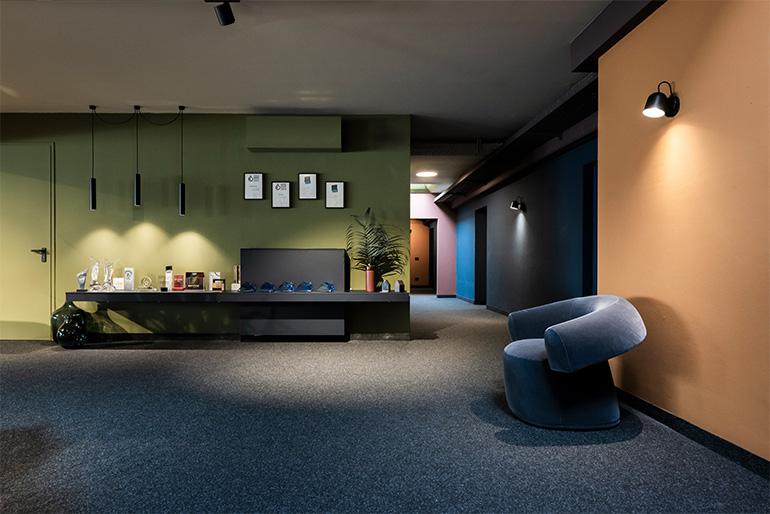
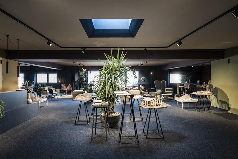
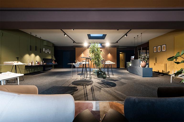
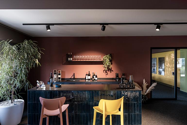
NOA has placed special emphasis on enhancing the work experience by adopting innovative concepts from the New Economy. Based on the belief that modern workplaces require much more than just productivity spaces, plenty of room was created for informal zones for social interaction and recreation. Drawing on its over a decade of experience in the hospitality sector, NOA borrows some ideas to enhance workplace well-being. Upon entering, visitors might be surprised by the type of open space that welcomes them: a spacious and fluid area that leads from a museum-like exhibition area with models, mood boards, and awards to a reception desk, an expansive lounge area, and a fully equipped bar counter.
“The studio is conceived as a constantly changing ensemble of spaces. Interior spaces should be able to adapt to different situations and change according to needs. An example of this is the so-called 'lobby', the beating heart of the building and a symbol of networking, which has always characterized NOA”, explains Caterina Betti, Interior Designer.
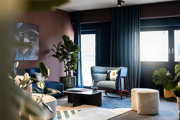
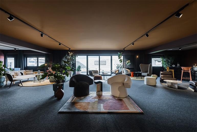
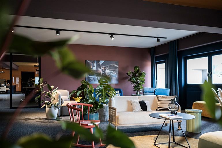
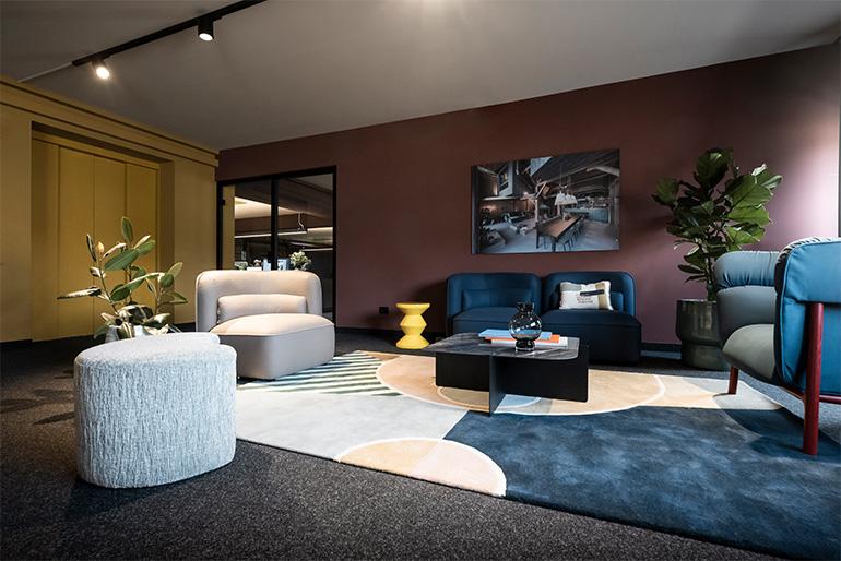
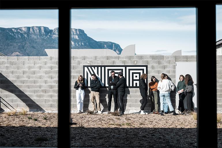
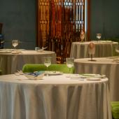
The lobby, the central space of the floor, symmetrically divides the studio into two areas. It occupies a space previously divided into nine rooms and opens onto a large terrace with views of Castel Firmiano in the foreground and the Renon plateau in the background. The lobby area that opens onto the terrace serves as a lounge, where a colourful mosaic of furniture from renowned Italian brands invites visitors to linger in ever-changing seating islands. There are areas for formal meetings, cosy sofas for coffee breaks, and cocktail chairs for more private conversations. This variety of options not only enriches the experience for those using the space but also offers clients the opportunity to personally test the products of companies such as Baxter, Billiani, Infiniti Design, Innova Imbottiti, Moroso, Pedrali, P&P Chairs, Sitlosophy, and many more. The office is a 360° showcase, from the lounge to the bathrooms: in every corner, something on display can be tested. The Silente collection, NOA's first product launch, is also exhibited. A museum-like spot lighting system highlights each design object.
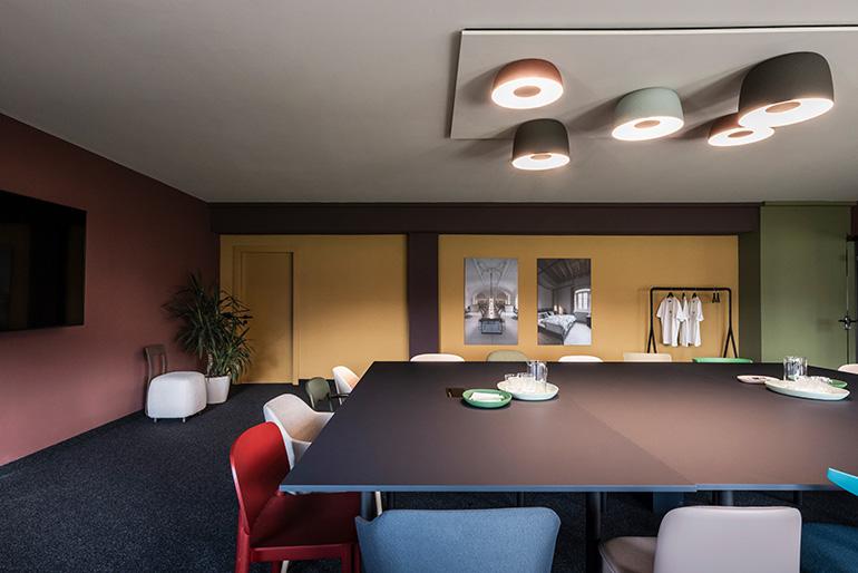
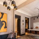
Extremely captivating in the lobby, but ubiquitous throughout the office, is the six-colour scheme, which gives the space a compositional narrative and transforms it into a place of intense sensory experience. The decision to add a variety of colours to the space has several reasons: Firstly, the confidence gained over the years that the use of particular colour combinations gives interior spaces an immersive identity. Projects such as Weisses Kreuz and Aeon are good examples of this. Secondly, the desire to showcase NOA's diversity (active in the field of urban planning, architecture, interior, furniture, lighting, and product design) through the six colour tones. Finally, the ability of colours to highlight each architectural element, be it old beams, new walls, or adapted ceilings, thus creating a stage-like spatial ensemble.
“The fascination of experimenting with colours manifested itself early on, when the paintwork was completed: Although there was no furniture yet, the space already told its own unique story”, adds Lukas Rungger.
To further enrich the space, various potted plants of different heights were introduced, some of them new and others carried over from the previous office. NOA has always emphasized the importance of vegetation in its interior design projects, and consequently in the office too there is great attention to the care of the indoor garden, in dialogue with the outdoor terrace.
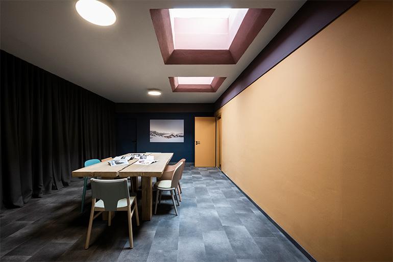
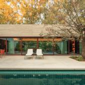
The lobby is flanked on one side by an open space for the architect’s and interior designer’s workstations, and on the other by a meeting room for 20 people. The floor plan also features a kitchen, a spacious material library, stationery storage, two additional offices, four additional meeting rooms, three restrooms, a room for press archive, and one for IT. A ping pong table provides additional variety. All these rooms have one thing in common: they can transform into other functions as needed, thereby generating added value. NOA aimed to create a spacious feeling and removed existing walls where necessary. The existing skylights were optimally used to bring as much light as possible into the rooms. The wide outdoor terrace consists partly of an extensive green roof and partly of a walkable rooftop lawn. In the warm months, it will serve as the counterpart to the lobby and offer a large outdoor area to clear one’s mind.
“The positive and curious feedback from the first visitors confirms that the work environment is an increasingly relevant issue everyone is dealing with. It is one of the places where we spend most of our time, which is why it is so important for our quality of life. With NOA, we wanted to create a lively and welcoming place, capable of continually reinventing itself”, concludes Niccolò Panzani, Interior Designer.
Ph. Alex Filz

