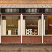
The “Frescopunk” side of ceramic tiles
Frescopunk was founded at the end of 2019 by a small team of three innovative people, armed with laptops. The interesting thing is that none of the three had previously worked in the porcelain stoneware industry, or even had anything to do with wall and floor coverings. Two of them had been working for renowned, international advertising agencies, as a creative director and as a consultant, and one of them is an architect. The storytelling about the company continues with great style ideas, a digital-based strategy of distribution and a strong brand identity.
To know more about the eclectic proposals and goals of Frescopunk we talked with CEO and founder Stephan Siegwart.
Surfaces International: How did the company's adventure start?
Stephan Siegwart: I have been investing in real estate for a few years now and in the course of renovating a multi-family house, I came across cement tiles, which are popular again today. I was immediately hooked by the fascinating colours and the latest design trends of this quite rare products. And I realized, that not only special materials such as wood or natural stone, but also graphic design in combination with special colours can give a room its unique character. And thus, the idea for Frescopunk was born.
Surfaces International: With what assumptions did you realize this idea?
Stephan Siegwart: It is one thing to develop a convincing design concept, but then to transfer it to a real product with technically superior aspects, that’s in a completely different league. The robustness and versatility of grès porcelain stoneware convinced us right from the start. Almost more important: there are endless possibilities for transferring colours and designs to the unfired material. We were surprised to find out, that a large part of the market uses these possibilities rather to imitate natural surfaces. That was never our goal, we wanted to offer exclusively graphic designs from the very beginning.
Surfaces International: But how do you start when you want to evaluate production possibilities in a market you don't know and have no contacts in?
S. Siegwart: We were very lucky! Our very first inquiry went to the ACIMAC (Associazione Costruttori Italiani Macchine Attrezzature per Ceramica). They immediately put a very skilled industry-expert at our side who, together with us, analyzed our needs, evaluated a list of suitable producers and arranged the meetings with these companies for us. This was back in September 2019 during Cersaie fair in Bologna.
Surfaces International: What’s the main design concept of Frescopunk?
S. Siegwart: Two different directions shape the design concept of Frescopunk. They are completely different and both are independent and function of their own. At first glance, they have nothing to do with each other. But when you start to combine them, it becomes magic.
One of these two design directions consists of repetitive patterns, as is typical for tiles. Here we aim for a very reduced, minimalistic design. But it is a tightrope walk between too much and too little design. Making a simple design distinctive can take a long time to achieve. Sometimes even more challenging than a more complicated design. Anything that is wrong will be spotted right away. So everything must be perfect. In these designs we use just two colours, which - in addition - are only subtly different from each other. The creative effect arises strongly from the special play of light of these colours. Intense testing was carried out to develop these colours for grès porcelain stoneware.
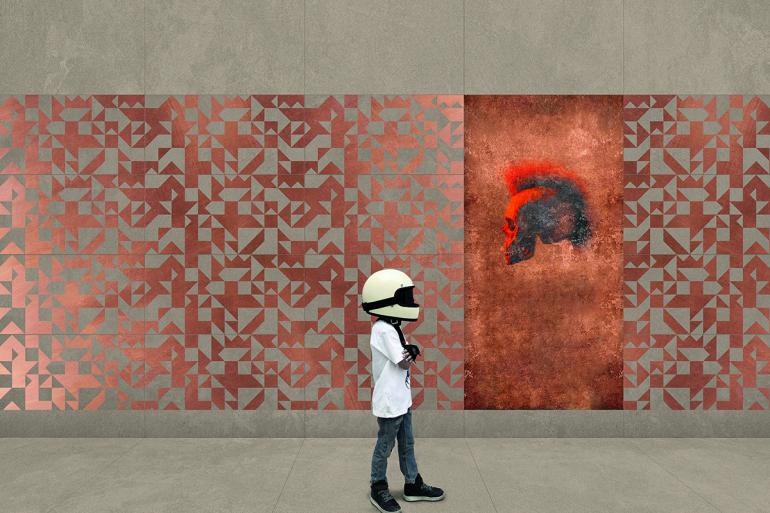
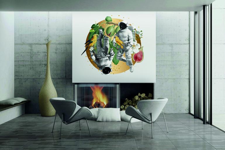
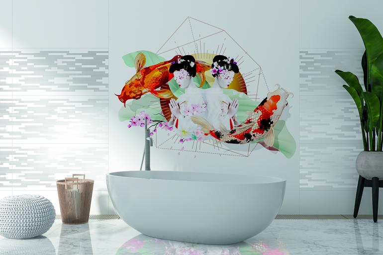
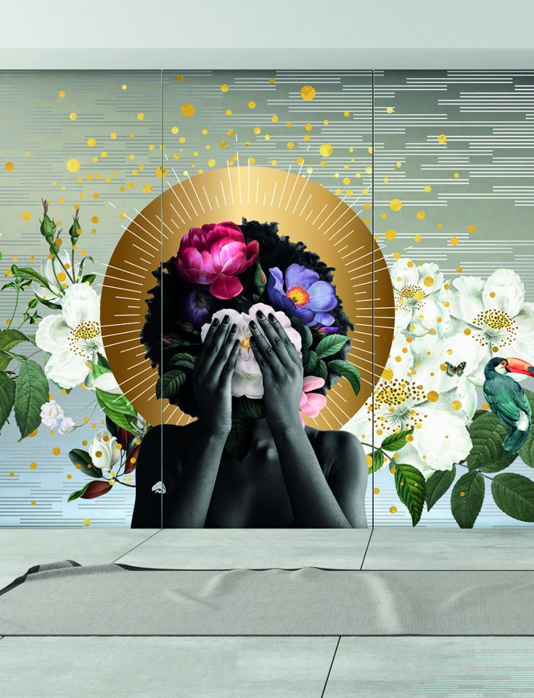
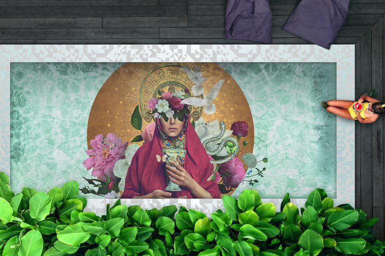
A completely different story are the Frescos. They pick up a decorative tradition for walls and ceilings from previous traditions. But now it is catapulted into the 21st century. Frescos just got punked, “frescopunked”. According to contemporary design perceptions, not always the entire wall has to be covered by a fresco. Rather, individual accents can be set with larger or smaller frescos. This becomes particularly exciting with the combination of our Tiles and our Frescos. They both are compatible in terms of colours and sizes and this results in endless possibilities of combination.
Read the full interview on Tile International Magazine: