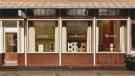
Revisiting tradition: Mi Pan bakery, Mexico City
With the Mi Pan project in Mexico City, the architectural practice Concentrico analyzed typical Mexican bakeries to understand their values, experiences, and essence. For more than 40 years, Mi Pan has been baking for everyone, reaching thousands of families and breaking down barriers between generations.
The concept
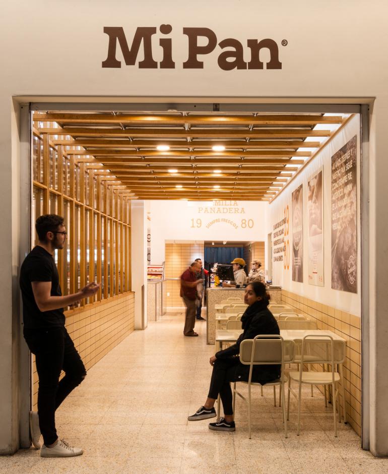
The design of Mi Pan honors the bakers and respects bakery traditions. The challenge, however, was to create a space that would reflect and embrace the people who visit the location. People are not used to buying in stores that invest in design, which led the design team to investigate the context. As they walked through the streets, the pattern they saw was one of colors and thousands of handmade signs and messages used to identify each individual store.
The self-serve layout was key to maintaining the original bakery experience. The goal was to invite customers to visit the bakery with a loved one in order to make it a shared experience.
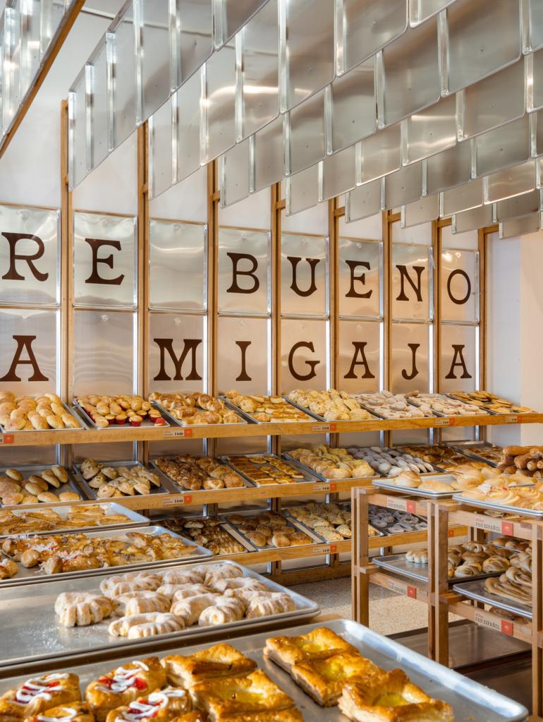
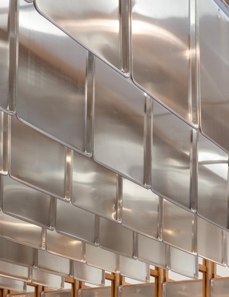
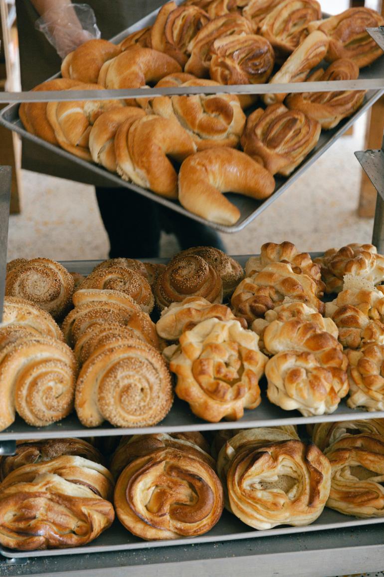
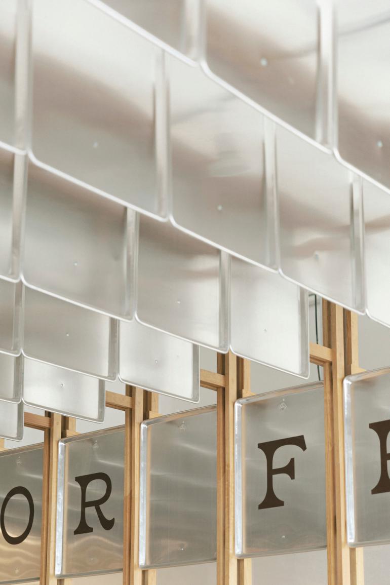
“The concept of Mi Pan is derived from its heart: its kitchen. There, we experience the magic and talent of the bakers who shape each loaf, one by one," notes Alejandro Peña, Director of Concentrico. "Throughout the bread baking process, trays are used to reflect the freshness of the product, so we incorporate them into the store."
Design and materials
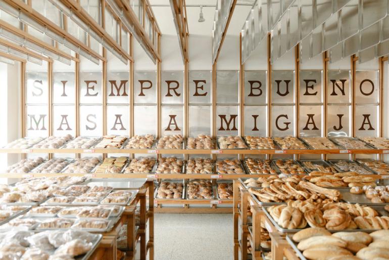
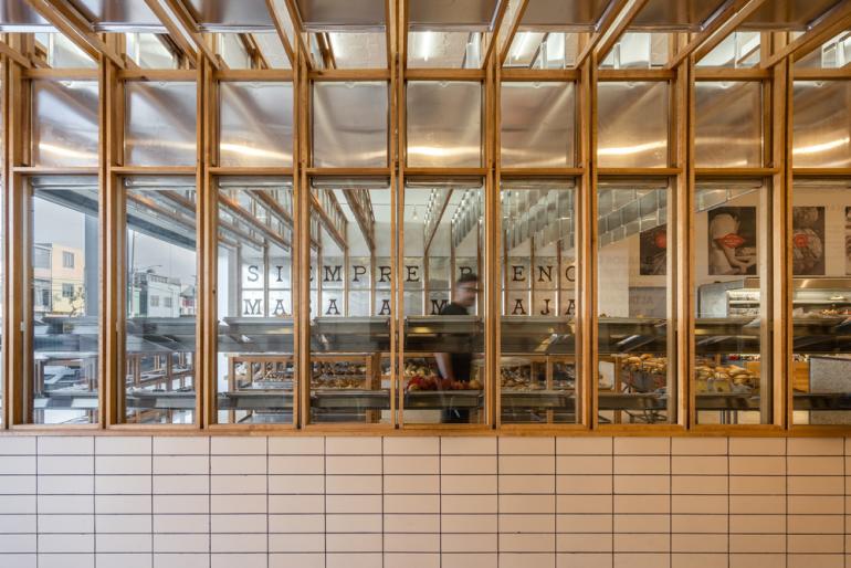
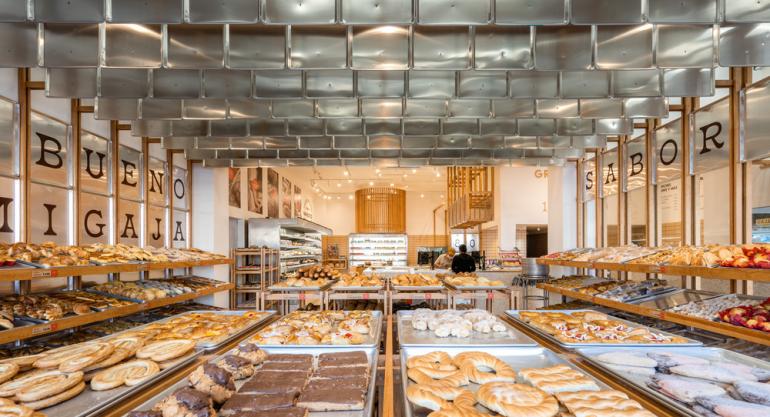
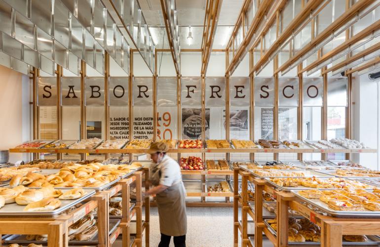
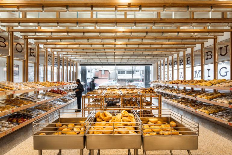
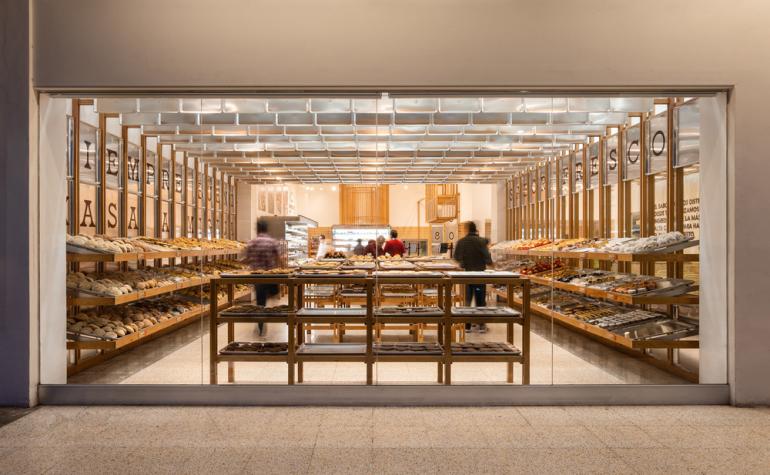
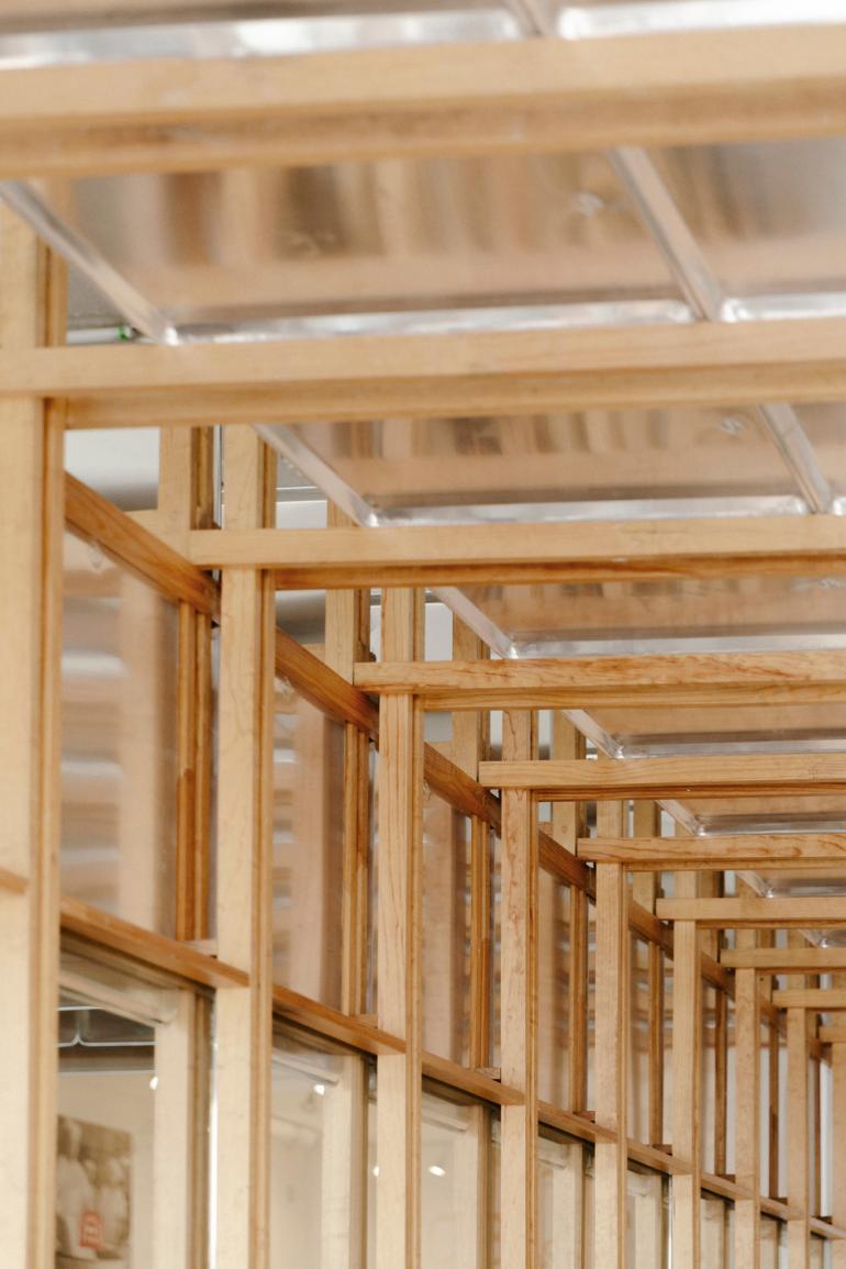
Metallic baking trays were used to link the baking process with the shopping experience. The signature use of metallic trays in the design makes it clear that everything revolves around the bread and its process. Pinewood boards were used to structure the design, and to add a warm balance to the coldness of the metallic trays.
The terrazzo floor connects the shop to many local supermarkets designed using the same material. However, to set Mi Pan's design apart, the designers integrated the brand’s orange color into the mix. The use of ceramic tiles also links the design to traditional bakeries. By combining all of these materials, it was possible to create a warm and unique environment, without intimidating the customers who visit.
The tray ceiling is not only impressive to look at, but also helps to lower the scale of the space and to make it more welcoming. It reflects the ceiling lighting and creates a great diffused ambient light, accompanied by product spotlights.
The store's layout is clear, with lateral access through the coffee shop area that allows customers to reach the center of the space. There, the route begins with the selection of bread and ends at the checkout counter. The space also includes custom-made metallic furniture, inspired by designs used in local restaurants in 1980, when the bakery opened.
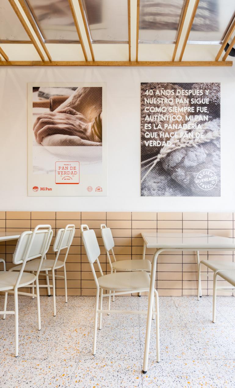
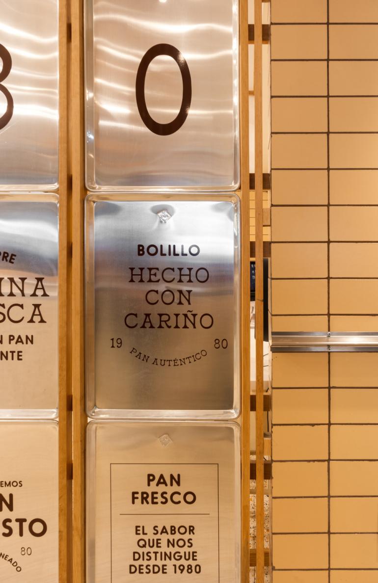
Communication throughout the store's interior mimics the tradition of handmade signs that are unique to each context. Through these messages, the company's story is told. Some of the phrases incorporated into the project include:
“Always good from dough to crumb” and “40 years later and our bread is still as it always was, authentic. Mi Pan is the bakery that makes real bread.”
Before leaving the store, the magic continues with displays of cakes marking unforgettable moments in everybody’s lives. The “Rosca de Reyes”, shared with family, and the “Pan de Muertos”, honoring those who are no longer here, helps customers stay close to their loved ones.
The design of Mi Pan focuses on creating a sense of community, while respecting and honoring the traditions of Mexican bakeries.
*credits
- Project: Mi Pan
- Location: Mexico City, Mexico
- Client: Mi Pan
- Art Direction: Alejandro Peña Villarreal
- Photos: Apertura Studio (Architectural Photography) | jPark Studio (Architectural Photography)
Suppliers:
- Ceramic Tiles – Ft Mosaics
- Terrazo Floor – Mosaicos Mexicanos
- Trays – La Ideal